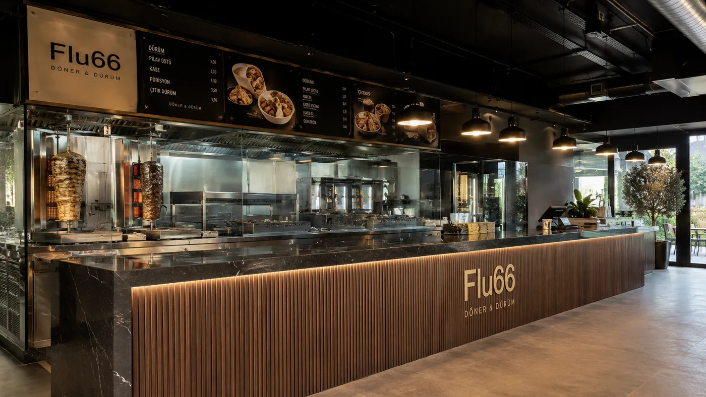
How does counter design affect sales?
In a cafe, bakery or restaurant, the counter is the engine of the space: the customer's first touchpoint, the order point, the prep area and the till all share the same few square metres. That's why a mistake in counter design can't be covered with decor — it slows the queue, tires the staff and, by the end of the day, lowers revenue. A correct setup is invisible: everything simply feels like it flows on its own.
The welcome: the first three seconds
A customer walking through the door should know where to go without thinking. Whether the counter reads from the entrance axis, whether the menu or display is visible at first glance, and whether a queue can form without locking the room are the three basic questions of the welcome. Eye contact is part of it too: a counter where staff can see the entrance even while working makes the welcome warmer by itself.
The prep line: one-way flow
After the order is taken, the product should travel one way: order → prep → pickup. Staff doubling back, crossing paths or stepping into each other's stations costs both speed and safety. Station order, equipment placement and under-counter storage are all built around this flow; at peak hour, what makes the difference is usually not the square metres but the correctness of this sequence.
Payment and pickup: separating the bottleneck
One of the most common problems we see is payment and pickup knotting at the same point: a customer who has paid stands waiting for their product and stops the queue. When these two points separate, the flow relaxes — the till takes orders, the pickup point works at the end of the line. Even in small spaces this separation can be achieved by shifting things a few steps.
Display: eye level sells
A counter's sales power lies not only in operations but in display. The product at eye level sells first; display lighting must show the product's true colour; and the small items placed on the way to the till are the best-known trigger of unplanned purchases. The display is not decor — it's a sales channel, and it's designed as one.
Materials and maintenance: built for heavy use
A counter takes hundreds of touches a day, plus heat, moisture and cleaning chemicals. Material selection is therefore a usage decision, not a visual one: surfaces that resist stains and impact, with few joints and fast cleaning, pay off in both hygiene and cost over time. You can see how these principles play out at different scales in the gastronomy counters among our concept visuals.
If you're opening a new space — or suspect your current counter layout is holding sales back — tell us about your space and your goal through the appointment form, and let's review the design together.
Related service
Shall we talk about your own space? The appointment form takes three minutes.
Let's talk your project →